Several people have dietary restrictions and/or preferences. However, mobile ordering apps typically do not inquire about this nor list prominent ingredients of dishes in their menus, which can lead to customers being served meals they cannot or do not want to consume. This can make the food ordering process stressful and/or limiting. I recognized that...
There is an opportunity to design an app that makes food ordering more accessible by creating a system that flags allergens and/or disliked ingredients for users before purchasing their meals.
To begin my research, I conducted a competitive audit of two direct competitors and two indirect competitors. My two direct competitors are: Hunny, a fusion Korean restaurant, and Hahm Ji Bach, a Korean BBQ restaurant. My two indirect competitors are DoorDash and UberEats.
I analyzed the menus as well as the ordering & checkout experience of each competitor's app (and website, if they had no app). Some gaps I identified were: none of these businesses inquired about dietary restrictions OR allow users to pay with cash, Hunny & Hahm Ji Bach lack an order history, and Hunny does not offer any sort of rewards/points system.


I interviewed someone who's had issues ordering food in restaurants due to their allergy to eggplants.

Name: Labiba Binte Amin
Age: 25
Traits: Major foodie, loves trying new restaurants and traveling around the world.

1: No inquiry of dietary restrictions - To increase accessibility, there will be a feature that asks users about their dietary needs to filter meals they cannot consume.
2: Menu items lacking explanation - Menu items can lack a description of what it is and/or its most prominent ingredients, which can harm users for both digestive and religious purposes.
3: Anxiety when ordering - Users feel anxious/shy asking for a dish to be tweaked. In a digital space where they are encouraged to provide their preferences, that anxiety is eliminated, and they can eat as they desire.
4: No option to pay with cash - Not everyone has a credit/debit card or wants to use one. Providing multiple payment options increases accessibility.

Name: Brandan Elliott
Education: M.S. in Comp. Sci
Hometown: Tampa, Florida
Family: Fianceé
Occupation: Software Engineer
About Me: Brandan is a software engineer that works at a startup in Miami, Florida. He recently got engaged to his fianceé, but due to his busy schedule, he is unable to spend as much time with her as he'd like. Brandan also suffers from celiac disease and needs to know which food options are gluten free. He needs a way to set up some quick date nights for when he gets home after a long day, while also steering clear of foods that may be damaging to him.
Goals:
Frustrations:
Brandan is a stressed software engineer who needs a way to quickly order takeout with gluten-free options because he wants to have seamless at-home date nights with his fianceé.
The goal is to simplify the ordering experience while also diversifying it. Since everyone's needs and preferences differ, it would be a good idea to also offer them the opportunity to input it manually, rather than only letting them choose from a list.
Goal: To use an app that will allow Brandan to easily order delivery and takeout from a nearby restaurant.

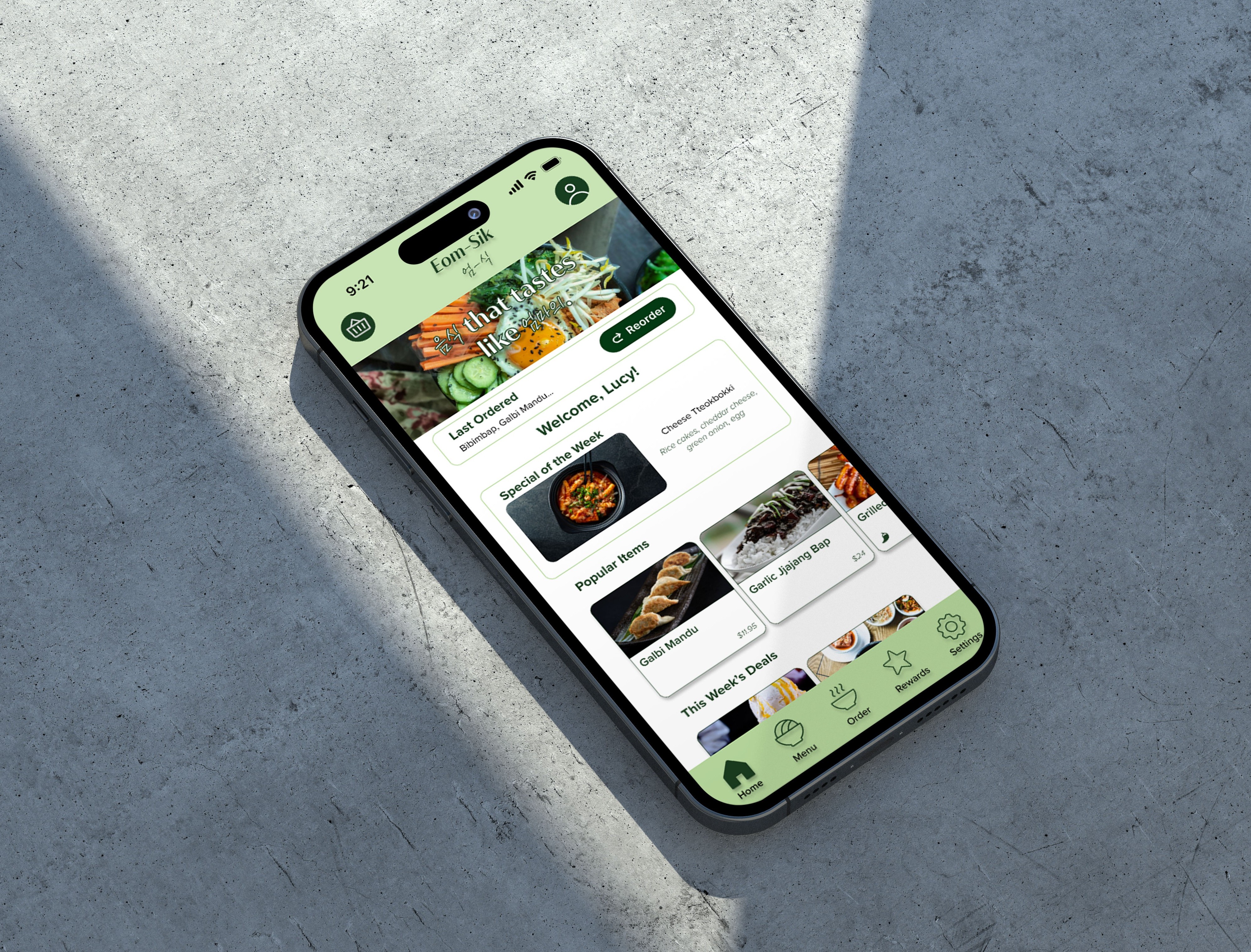
User Task: Use the Eom-Sik app to place a takeout order with dietary restrictions.

While sketching, I was trying to think of how I can make everything stand out from your typical takeout app (e.g. McDonald's, Wendy's), as well as what was the best way to design the dietary restrictions screen. The goal was to make everything as simple as possible without confusing users and to avoid making them impatient. During the process, I was also trying to figure out if the flow I devised in my user flow made the most sense.
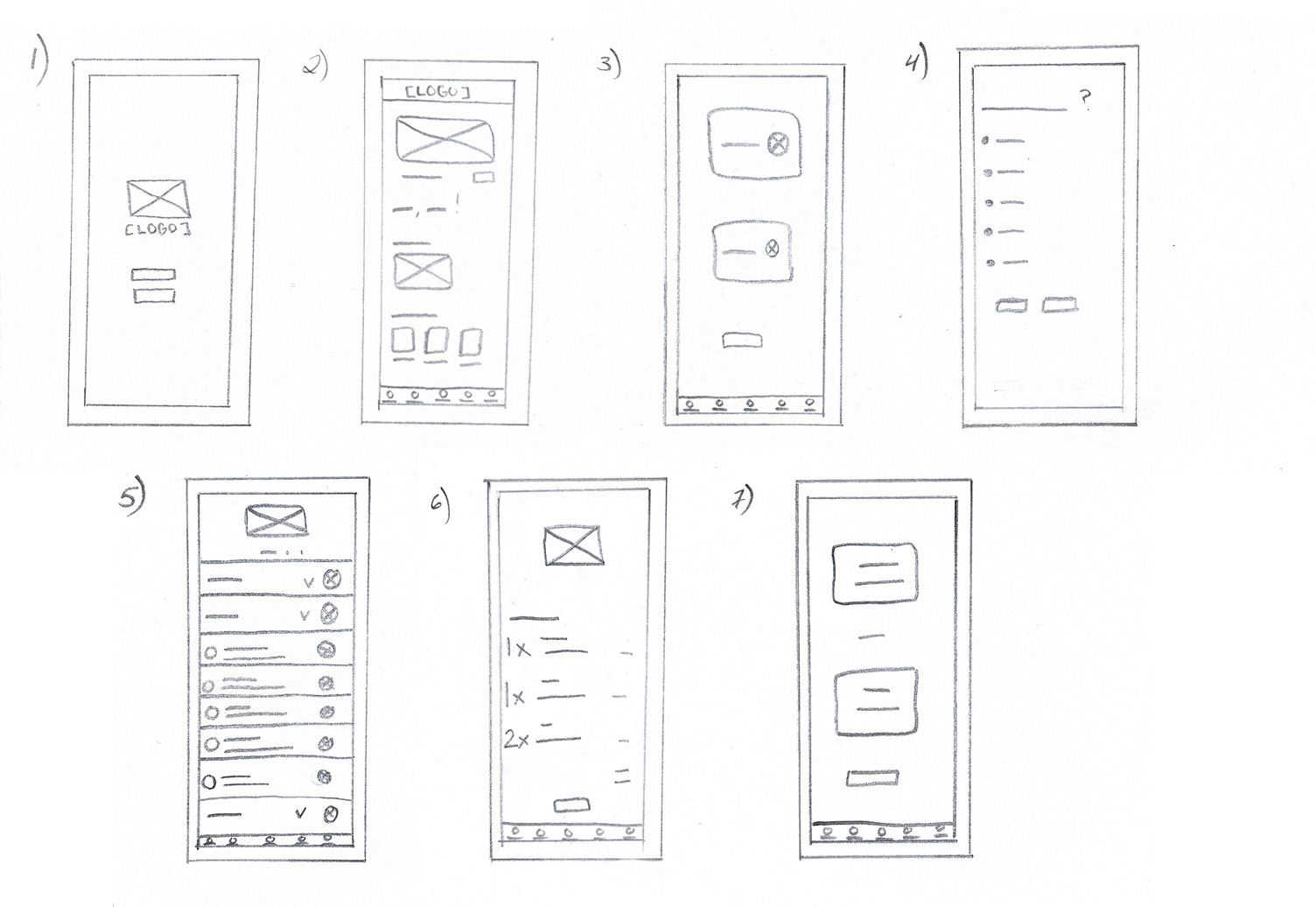
The number one goal in mind was being as inclusive as possible, but the question was, how? If we only provide a list, something may be left out. The best solution was to give users the opportunity to input their own preferences, so the menu uniquely caters to each user.

There were multiple questions packed into this one screen; how do we design our menu? How do we actually incorporate the users' preferences into the menu? How do we show our ingredients? I landed on a toggleable filter that shows what is safe to eat.

In the low-fi prototype, you can navigate the homepage and begin a delivery order. You must add an appetizer, entrée, and dessert that adheres to your preferences to your order, then head to checkout using the "Cash" payment method. The rewards screen can also be viewed.
Click here for the low-fi prototype.


I conducted two rounds of three supervised usability studies. My participants were a 22 year old male, a 23 year old female with stomach issues, and a 55 year old female who self-identifies as a picky eater. Each session was to last less than 10 minutes, with the goals of determining if users with dietary restrictions find it easy to input and apply their restrictions to the menu, and determining if the checkout process is easy to understand and complete.
I aimed to find an answer to these questions:

If dropdowns didn’t work, how could I lay out the menu items clearly while still keeping them grouped & filtered? I created components for each item, and turned the filtered ones red, and using a section similar to the dropdown to act as a divider for each part of the menu. I also replaced the ingredient list with the price of the dish. This ended up being much more visually attractive.

In order to lessen confusion, I figured it would be best to separate lifestyles and allergens from disliked ingredients by asking two separate questions. Both lists are also much more inclusive, while still giving users the option to input their own needs. I also added a "does not apply" option, because I was so focused on those who do have restrictions...I forgot not everyone does!

Click here to view the final prototype.


While designing, I made sure I included icons when displaying the parts of the menu (deals, appetizers, etc.) to ease navigation. I used color combinations with high contrast (dark green with white, yellow with black, dark green with yellow) to make elements distinguishable for users with low vision or color blindness. Any component that had a light color was given a drop shadow to make it distinguishable for other objects.

Eom-Sik allows users to order food adjusted to their needs and preferences easily. It's perfect for picky eaters or those with food allergies.
While working on Eom-Sik, I learned a multitude of things, from cultural aspects to technical configurations. I learned a lot about different Korean foods and dietary restrictions that exist. I learned how to work with overlays in Figma, as well as how to utilize and customize assets as per my design. However, some assets show faulty when interacting with the prototype, despite being customized correctly. An example of this is, my text fields and some buttons turning purple when being pressed.
First of all, I would like to incorporate a section during Checkout that allows users to apply their unlocked rewards. This allows them to use their rewards when doing a mobile order, rather than doing it in-person, which is not feasible.
Secondly, I would like to create a way for users to favorite their favorite menu items, and allow them to easily select it for future orders, to minimize their order process. I would also like to create a "Save for Future Orders" button that appears during or post-checkout, so users who always order the same dish(es) can do so with ease for future visits.
Lastly, I would like to create a counter that automatically starts at "1" rather than "0" for when users are adding dishes to the cart.